Okay, so — teal is kind of everywhere right now. And it's not just a vibe I made up: WGSN and Coloro named Transformative Teal their Color of the Year for 2026, Etsy picked the closely related Patina Blue, and Pinterest's whole 2026 palette leans into the same oceanic, blue-green world with Cool Blue as its hero shade. Three different trend reports, all pointing the same direction. Blue-green is the color story of the year.
Which, honestly, is great news for me — because this is exactly the world my Glitterica collection already lives in.
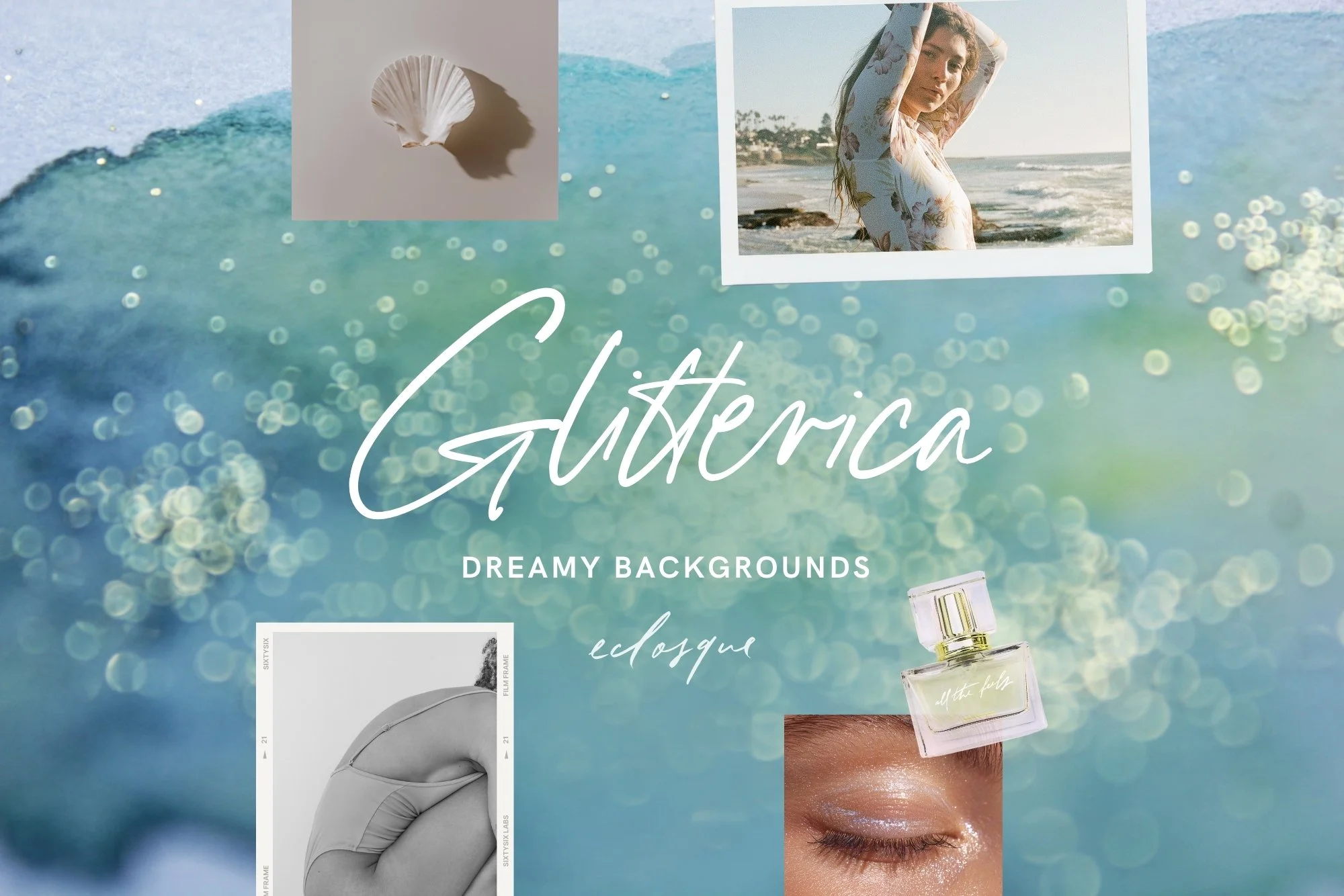
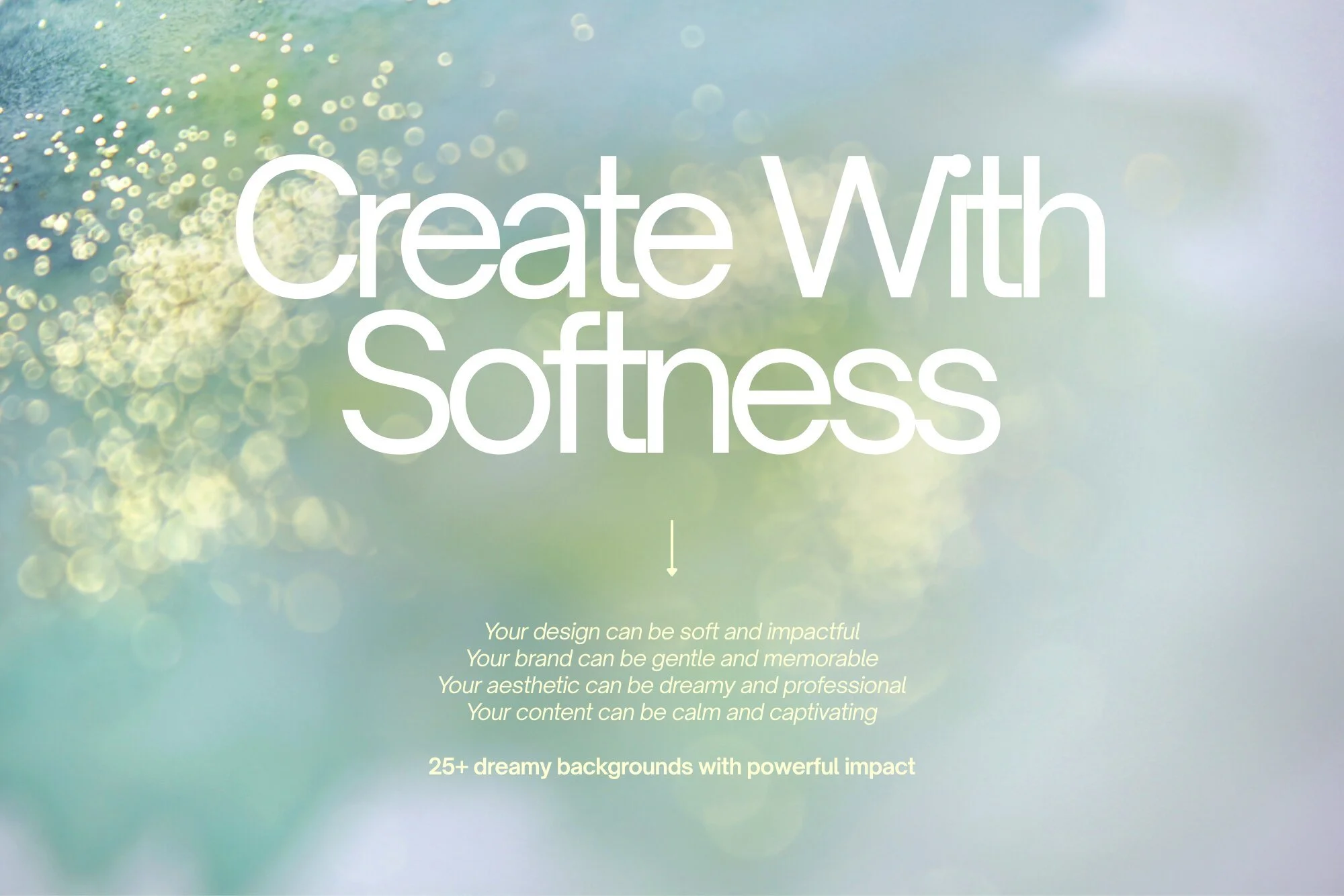
Meet Glitterica — dreamy teal watercolor backgrounds loaded with glitter, bokeh, and all the oceanic vibes 2026 is obsessed with 🌊✨
Why everyone's suddenly obsessed with teal
Teal just hits a sweet spot. It's calm like blue, but there's enough green in it to feel alive instead of cold. Every trend report describes it the same way — restorative, grounding, regenerative — which, after a few years of beige-on-beige everything, honestly feels like a breath of fresh air.
It's also just an easy color to work with. It photographs beautifully, sits nicely next to skin tones and gold accents, and looks premium without trying too hard. That's probably why it's popping up everywhere in branding and design right now, not just fashion and interiors.
Bringing Teal Into Your Own Designs
You don't need a full rebrand to ride this trend. A few ways to bring teal in without overhauling everything:
Use it as a background, not just an accent. A full teal watercolor or glitter background does more visual work than a small color swatch ever could — it sets the whole mood of a post before anyone reads a word of copy.
Layer texture on top of color. Flat teal is fine. Teal with movement — watercolor bleed, soft glitter, a bit of bokeh — feels considered and current, and it's what separates a scroll-stopping graphic from a plain color block.
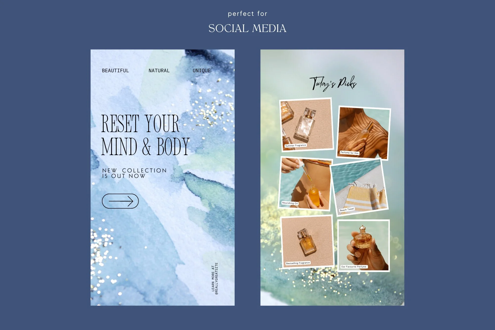
Let it carry quote or product content. Teal backgrounds are forgiving with white or cream text, product photography, and film-style overlays, which makes them genuinely versatile for anything from Reels covers to Pinterest pins to website banners.
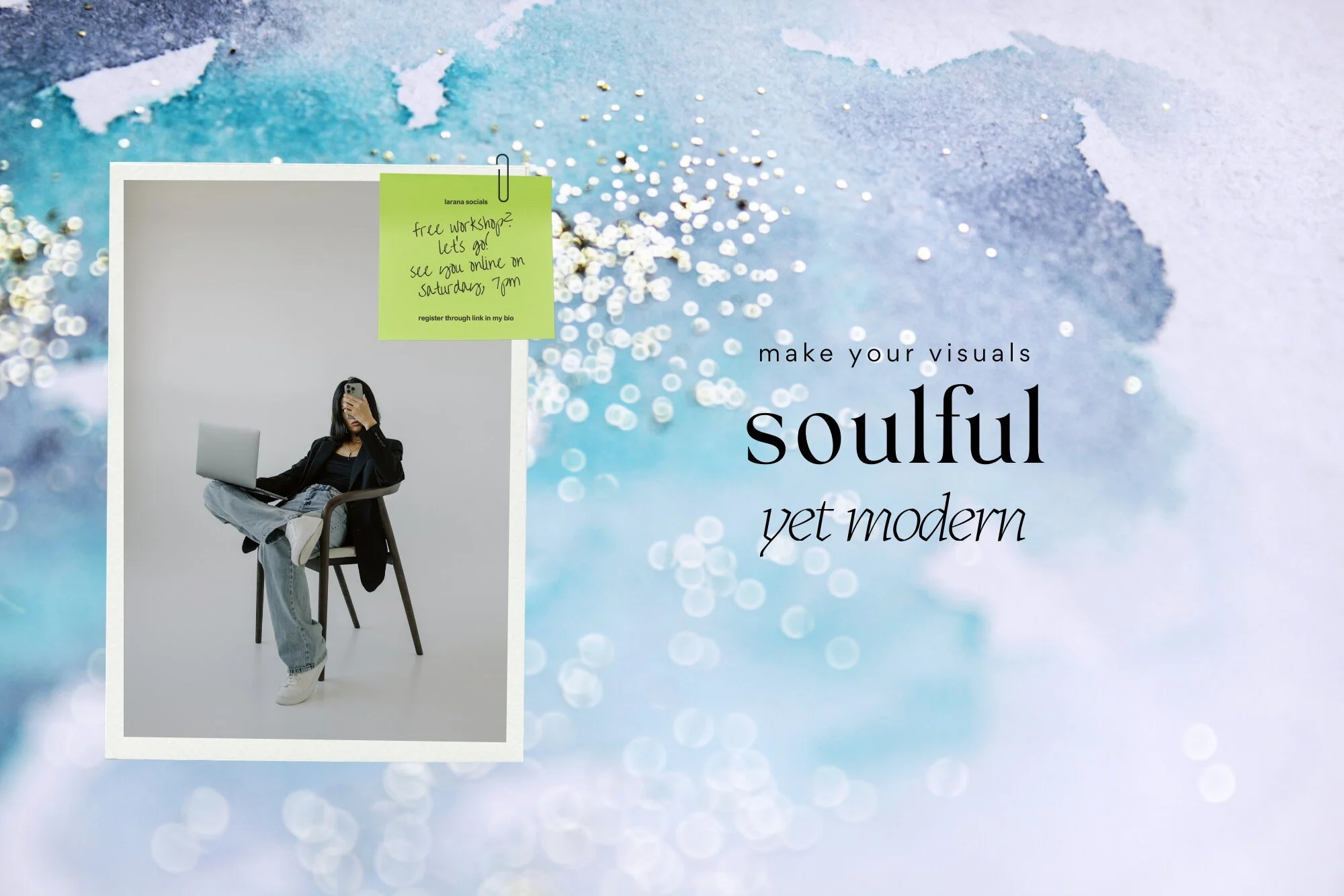
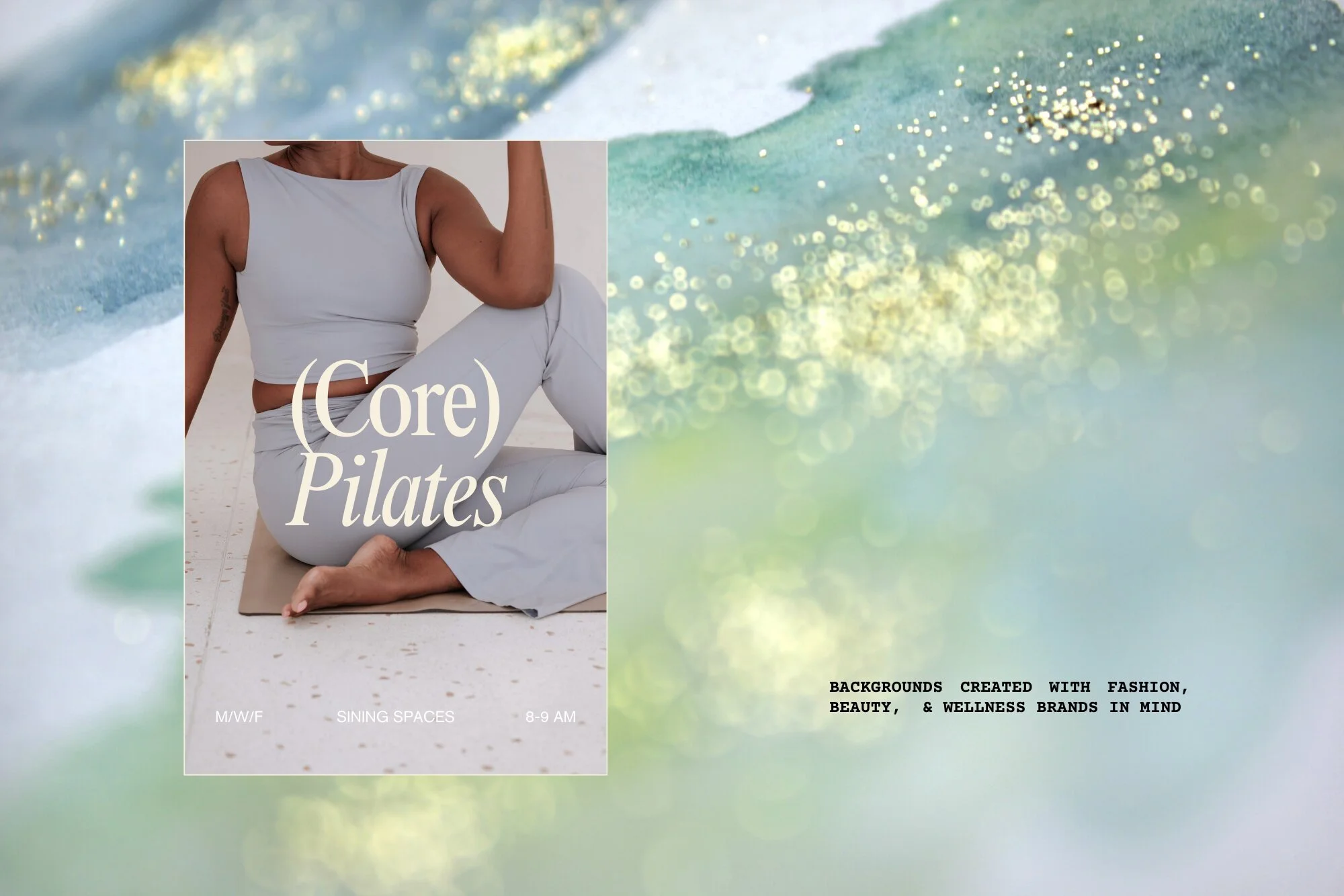
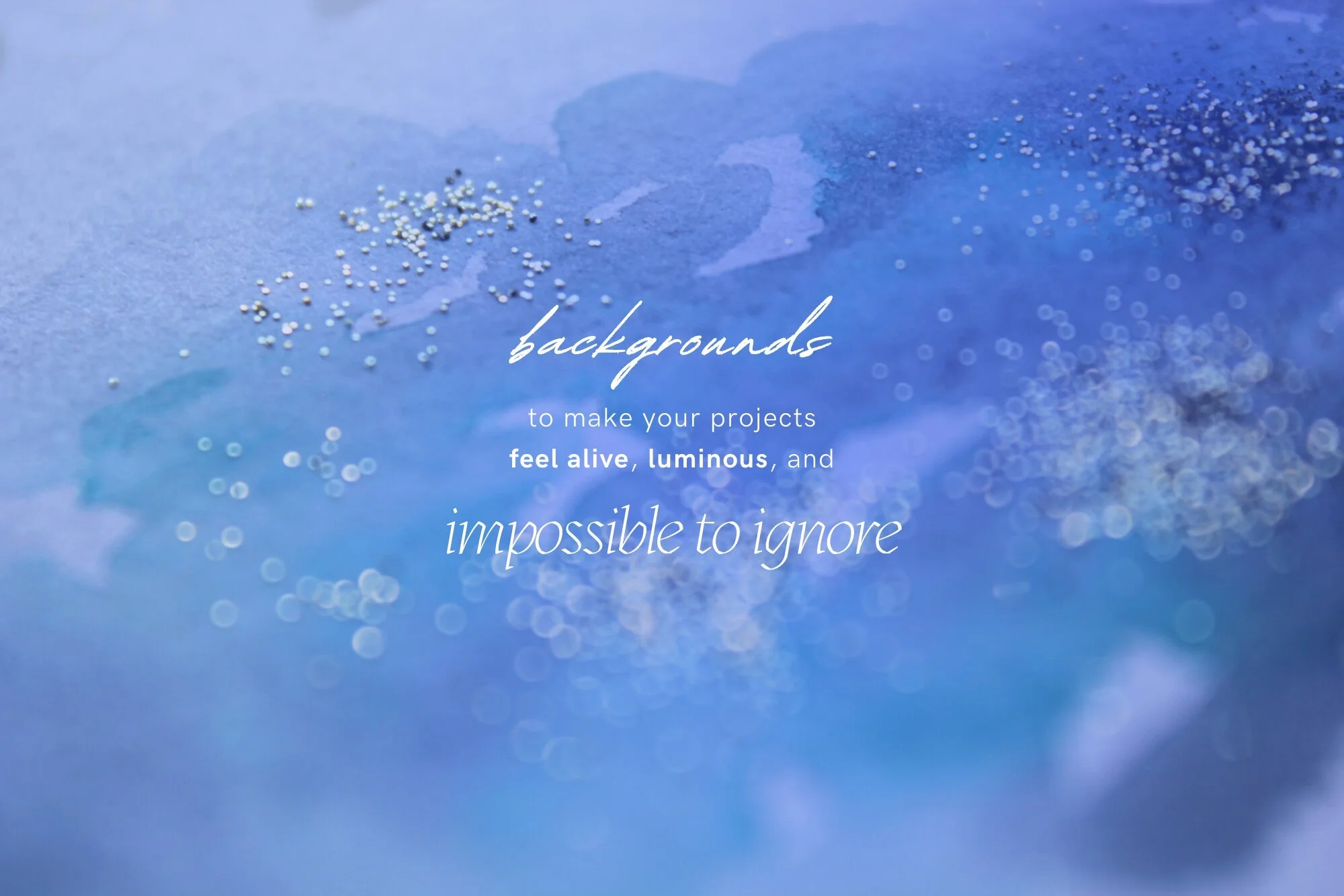
This is what the Glitterica – Teal Glitter Watercolor Backgrounds collection was designed for: soft artistic watercolor washes in blue and green, layered with delicate glitter and bokeh, built to hold text, product shots, or lifestyle photography without competing with them.
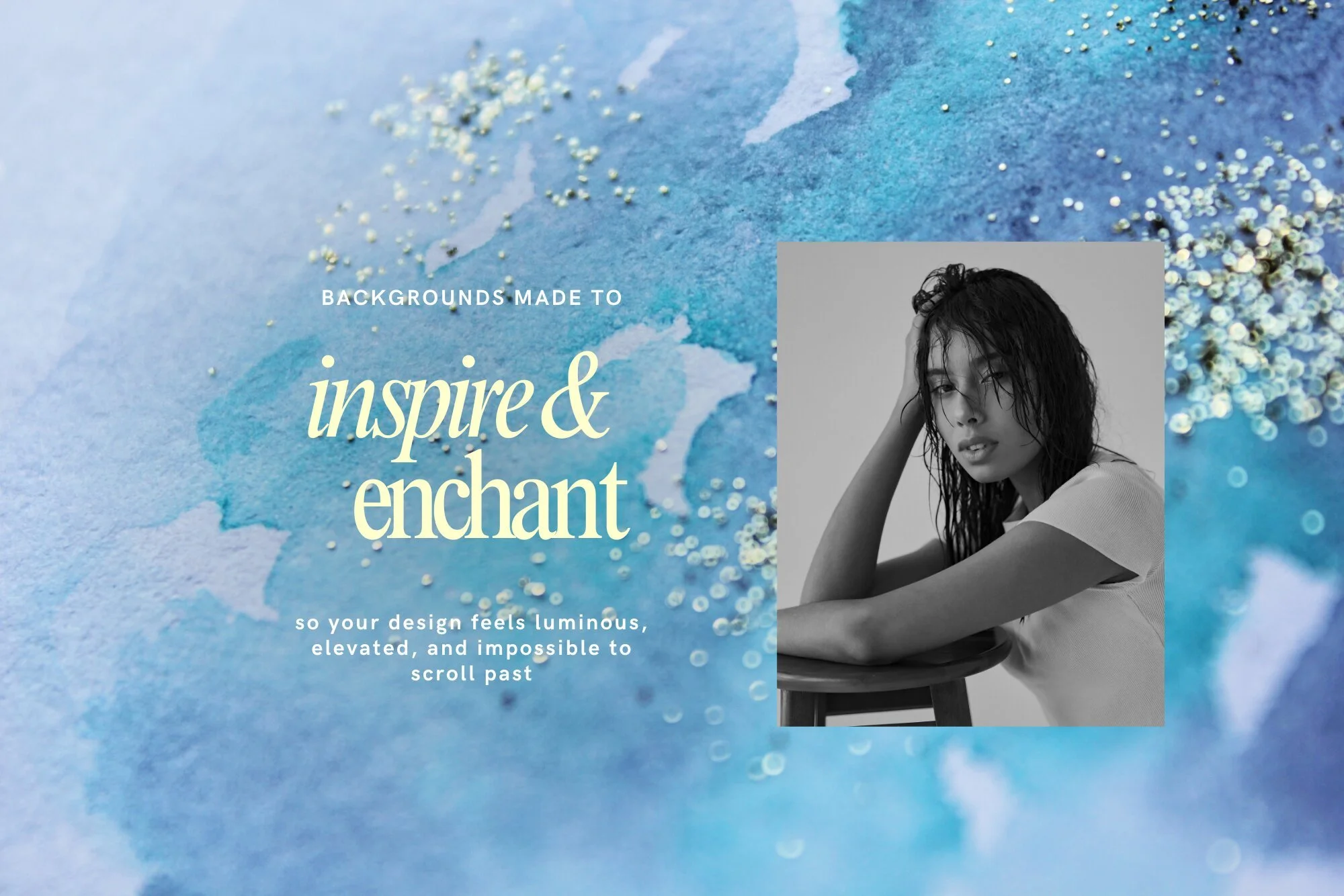
This is Glitterica doing what it does best: making a simple portrait feel luminous and impossible to scroll past.
What's actually in the Glitterica collection
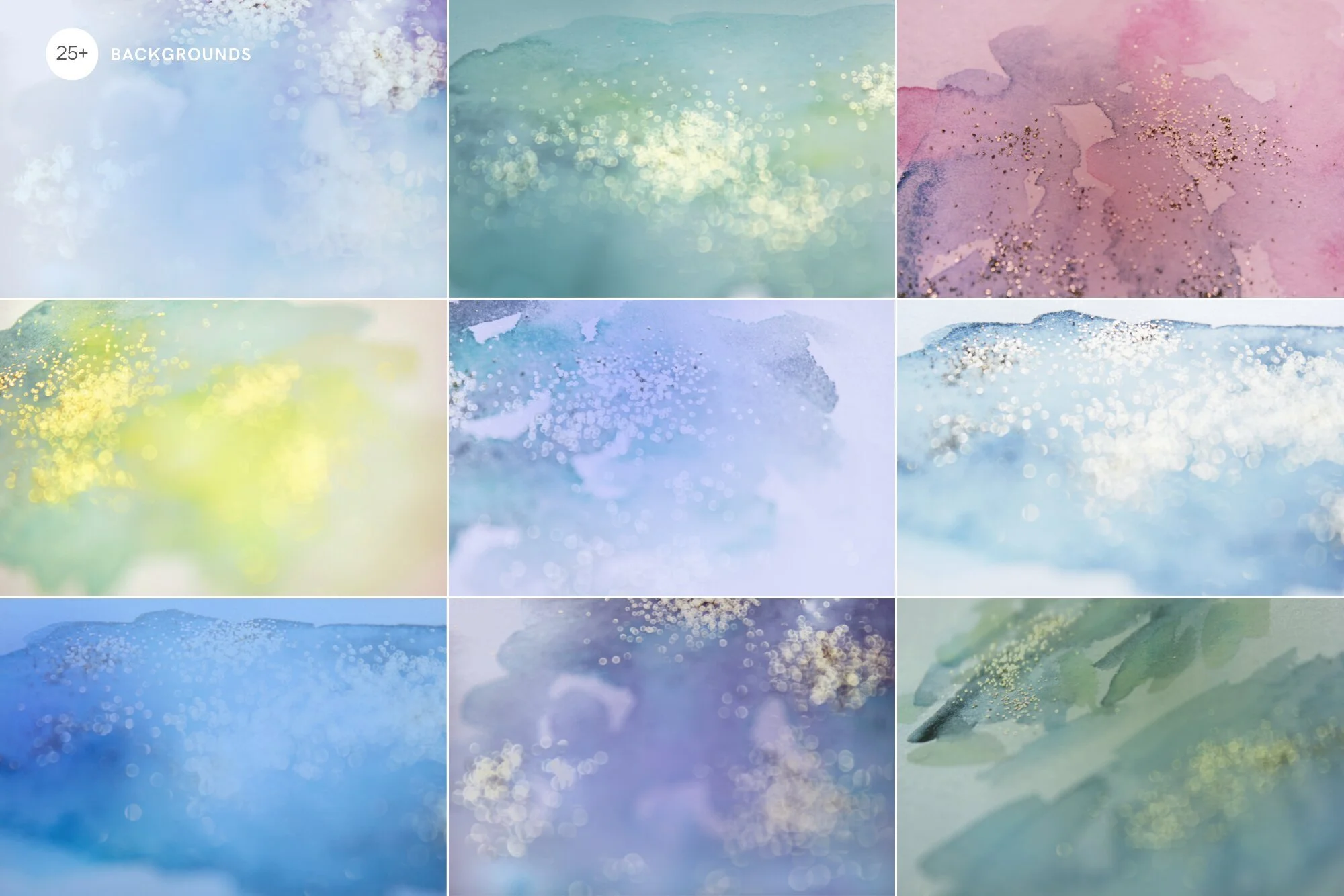
Glitterica is my set of watercolor + glitter digital backgrounds built around this exact palette — but it's not just one shade of teal on repeat. There's a bit of range in there:
Deep teal & ocean tones — the heart of the collection: sparkling, marine-inspired blue-green washes with soft bokeh, the closest match to 2026's Transformative Teal.
Emerald & gold shimmer — a warmer, greener take with gold glitter on top. Feels very beauty/spring.
Icy blue-lilac — softer and more muted, closer to Pinterest's Cool Blue — good if you want something calmer and more minimal.
Dreamy lilac & pink — a break from the blue-green, softer and more feminine, but still part of the same design world.
Golden apricot — warm, sunlit tones for fragrance/beauty content.
These shades work especially well for beauty, wellness, and self-care brands and coaches, but they're just as at home in fashion, lifestyle, fragrance, yoga and pilates studios, spas, and content creators and bloggers who want visuals that feel calm, premium, and a little dreamy.
Every background here is a watercolor I hand-painted myself, layered with delicate glitter and light bokeh I shot and edited on my own — no AI involved. Think of it as a base — you drop your text, product photo, or logo on top, and it instantly looks designed instead of thrown together.
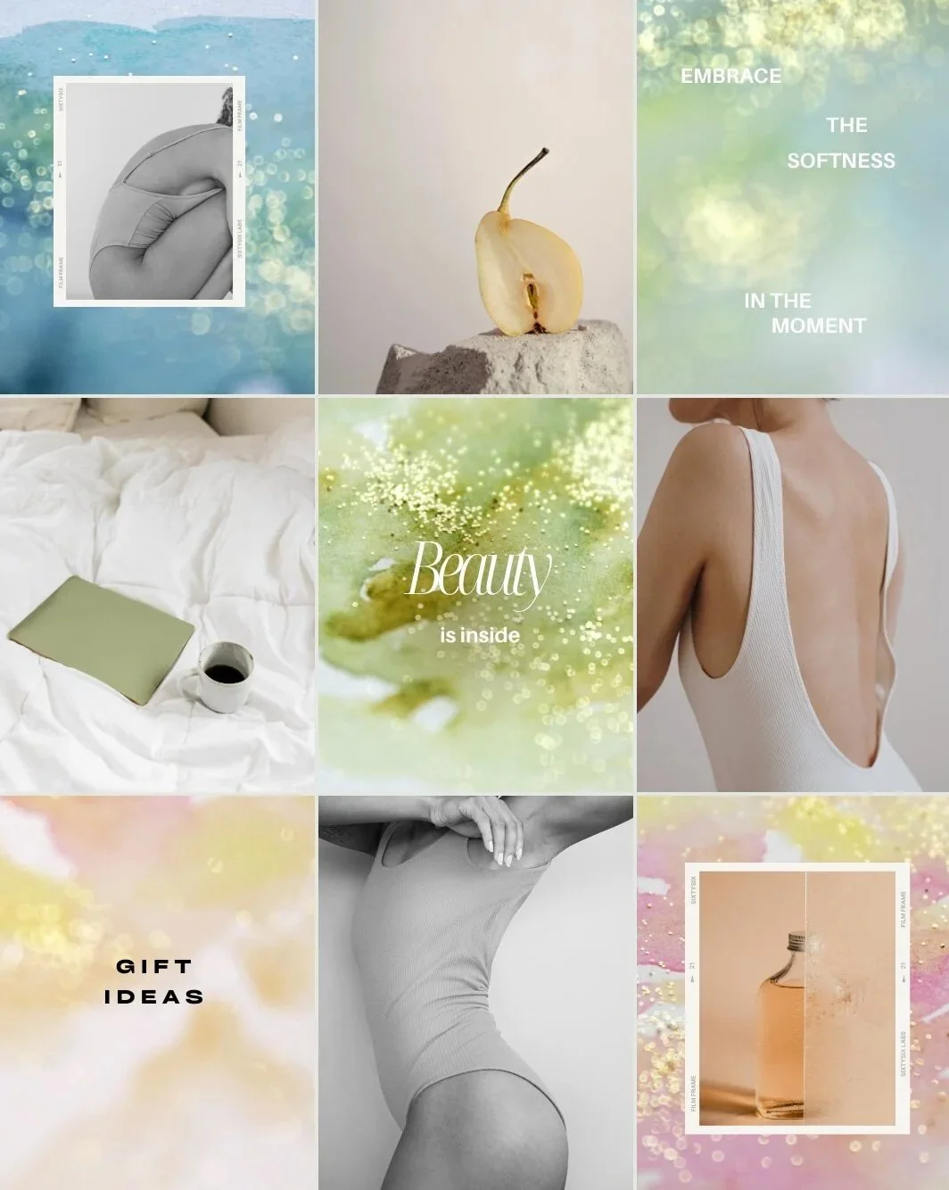
What you can actually do with these
These are backgrounds and digital papers — they're built to be flexible across just about any design or branding use case:
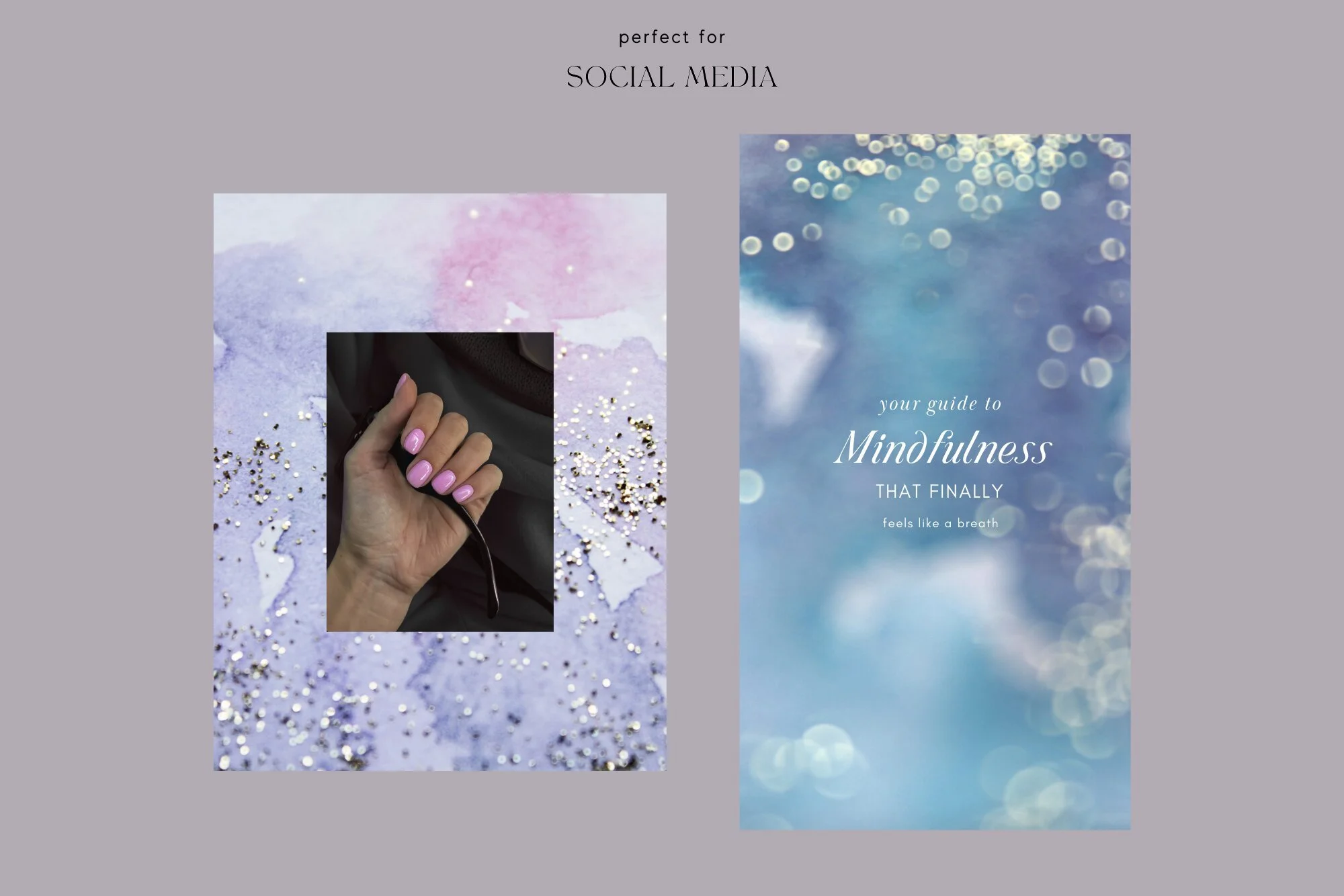
Instagram carousels & Story templates — a background behind a quote or a product callout instantly makes the whole post feel cohesive.
Reels covers — a textured teal backdrop with one line of text already looks polished before anyone even taps play.
Pinterest pins — teal is doing double duty here: it's on-trend and it stands out in a feed still full of beige and neutrals.
Website banners & hero sections — a teal watercolor background behind a product photo or headline gives a page an immediate sense of calm, premium mood.
Branding & graphic design work — great as a base layer for social graphics, beauty & wellness packaging design, or moodboards when you don't want to start from a blank page.
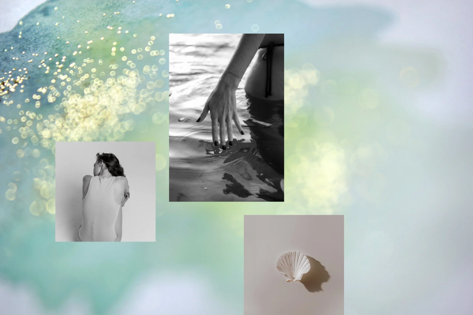
Moodboards, generally — even just as a texture layer, these pull scattered visual references into something that feels like one cohesive story.
Bottom line
Teal isn't just a random micro-trend — it's the one thing every major 2026 forecast agrees on. Glitterica makes it easy to actually use: watercolor backgrounds and digital papers I hand-painted and photographed myself, ready to sit behind your text, photos, or branding for Instagram, Pinterest, and web. Whether you use it as a full background, a Story template base, or a texture layer behind your product photography, it's a low-effort way to keep your content feeling current without chasing every trend that comes through your feed.
You can check out the full Glitterica – Teal Glitter Watercolor Backgrounds collection here— royalty-free, with commercial licensing included, designed and hand-painted by me, an independent artist.
Pin this for later
Teal is everywhere in 2026 — save this so you don't lose the palette when you need it.